UI/UX Odoo 17
Odoo ERP gets a refreshed design and a modern touch with Odoo 17. The new user interface is simple and pleasant, offering a unique user experience.
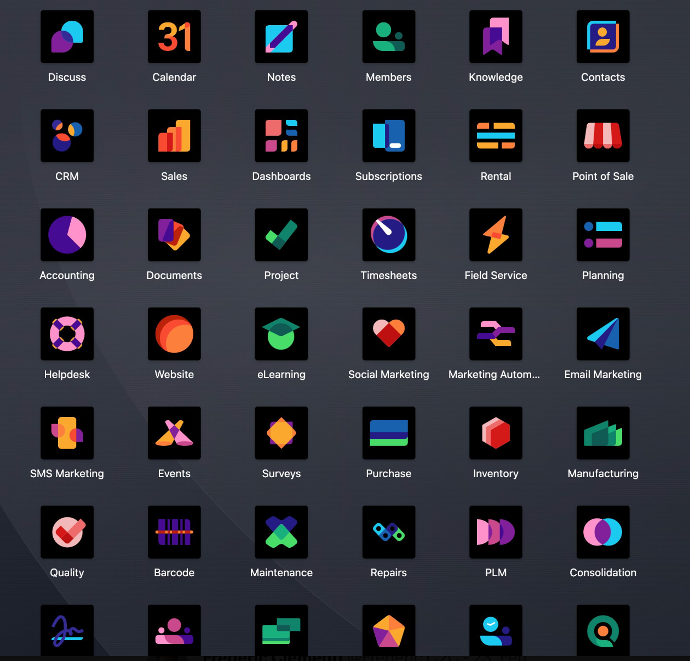
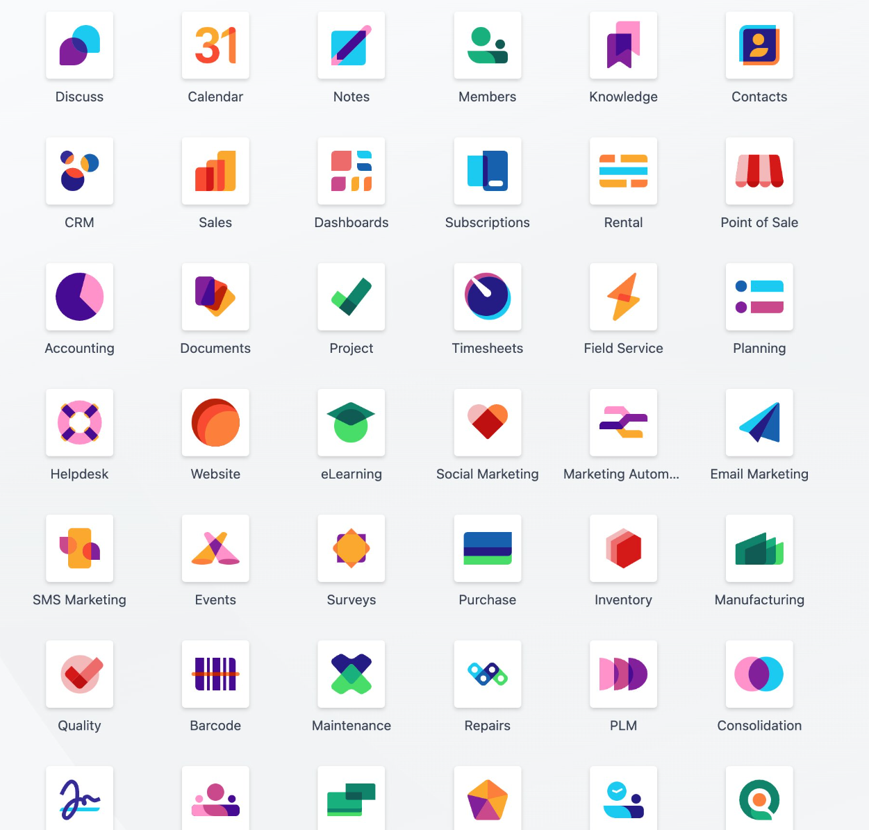
The Odoo App Icons have received a sleek and minimalist makeover, adding an attractive touch to the UI. Users can also arrange them as they like through drag-and-drop, customizing their home screens. Odoo 17 also introduces a Dark Mode for the user interface. Overall, the new UI is more responsive, ensuring seamless and fast performance on all devices.
Another user experience highlight in Odoo 17 is the introduction of shortcuts. With the help of quick commands, records can be selected quickly and easily. Let's not forget the pop-ups, which can now be moved via drag-and-drop and customized according to individual needs and workflows.
Search view and function
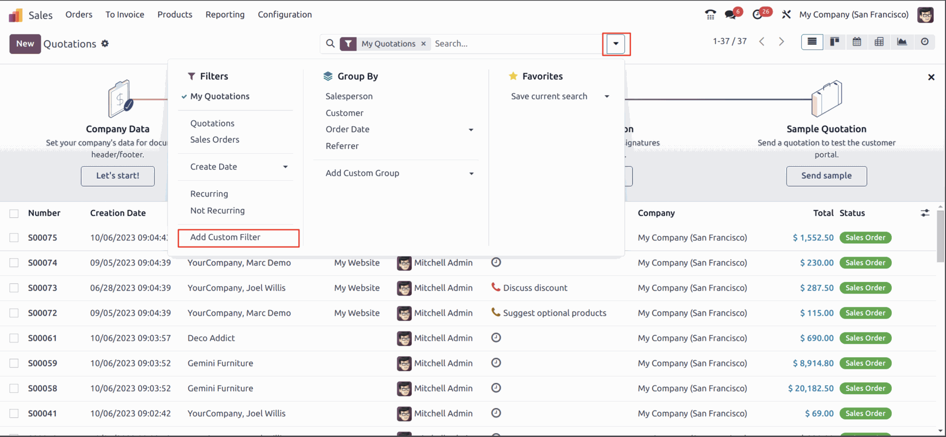
The search view in Odoo 17 follows the new Milk theme, providing a clear structure. The functions of "Filter", "Group" and "Favorites" have been consolidated for user-friendly navigation and efficient searching. This search can now be conducted across multiple Odoo apps simultaneously.

Fixed headers
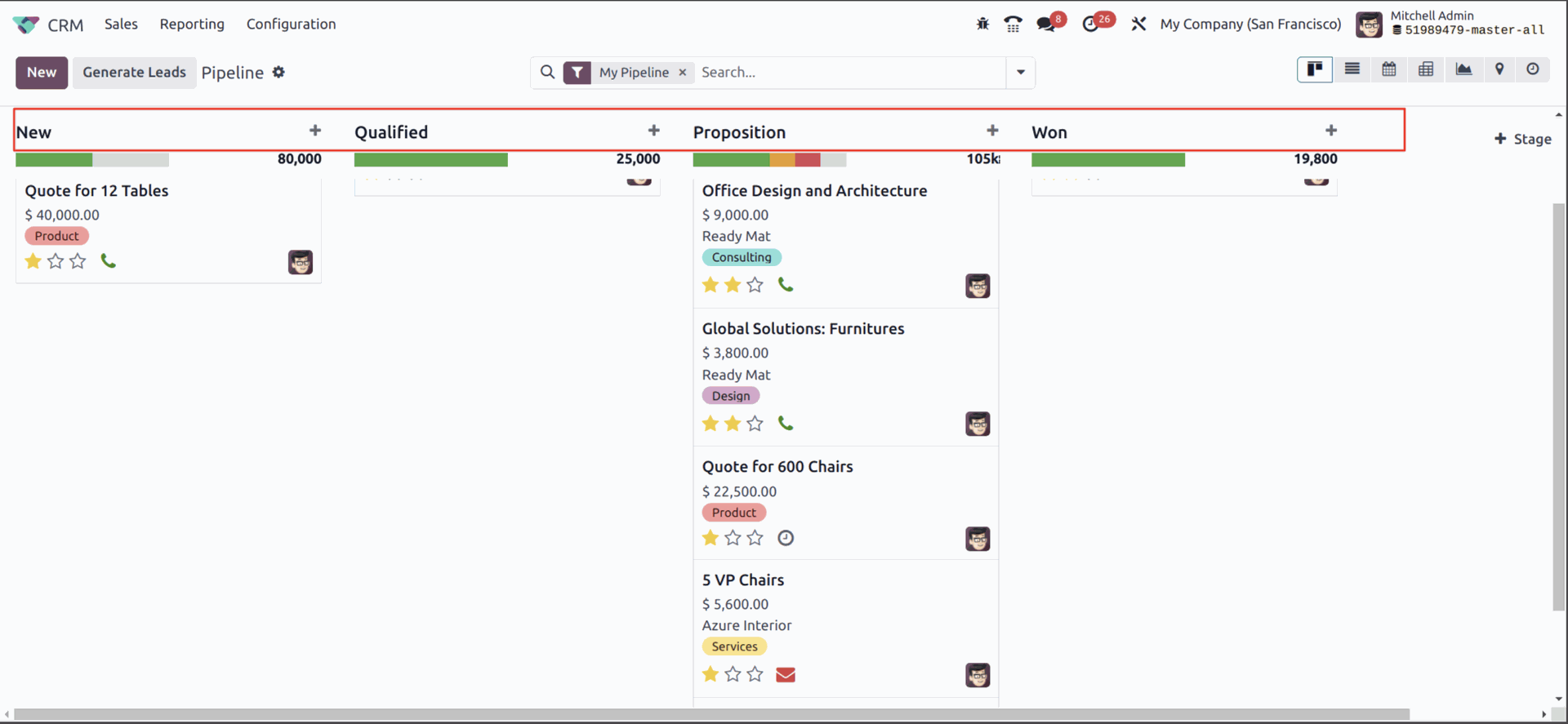
In Odoo 17, list and Kanban headers can be pinned to the top, ensuring they remain visible when scrolling down.

Spreadsheet
IIn Odoo 17, it is now possible to create snapshots and add images to spreadsheets. These visual aids enhance understanding and collaboration among the team members.
Update Apps Odoo 17
Odoo 17 apps have received significant upgrades, offering exciting features and improvements compared to earlier versions. Additionally, Odoo 17 allows seamless integration with a variety of third-party applications, further streamlining your workflows.
New Odoo To-do App
While not entirely new, the Odoo To-Do app replaces the Odoo Notes module. Seamlessly integrated into the entire Odoo Business Suite, the To-Do app allows users to create, manage, and track tasks.
New Odoo PoS features
In the updated Point of Sale (PoS) module of Odoo 17, restaurant owners can now show their guests the current status of all orders on the display. Each order is also assigned a unique tracking number for easy status monitoring. Moreover, there is a generic component for the Odoo logo in SVG format, which can be displayed in either monochrome or color, based on preferences.
Smoother Workflows with eSign in Odoo 17
Odoo 17 introduces a user-friendly and innovative feature that revolutionizes document management. Users receive reminders for documents awaiting their signature, making the signing process more efficient and seamless. Both internally and externally, all users have the option to consider or dismiss these reminders as needed.
These are the key updates in Odoo 17. This page is continuously updated.

